Color Psychology: Choosing the Right Shades for Every Room
Did you know the color of your walls can influence your mood, productivity, and even your sleep? It’s not just about aesthetics—color psychology plays a powerful role in how we experience our homes. Whether you want a calming bedroom, an energizing home office, or a welcoming living room, choosing the right hues can make all the difference.
In this guide, we’ll explore how different colors affect emotions and behavior, plus practical tips for selecting the perfect shades for every space in your home.
The Science Behind Color & Mood
Colors don’t just look different—they feel different. Studies show that warm tones (reds, oranges, yellows) stimulate energy and conversation, while cool tones (blues, greens, lavenders) promote relaxation and focus.
But it’s not just about temperature. Saturation and brightness matter too:
- Soft, muted pastels feel soothing.
- Deep, rich jewel tones add drama and coziness.
- Bright, saturated hues spark creativity (but can overwhelm in large doses).
For example, a pale sage green might make a bedroom feel serene, while an emerald green in a dining room feels luxurious and inviting.
Best Colors for Key Rooms
1. Living Room: Warm & Welcoming
- Earth tones (warm beige, terracotta) – Create a cozy, grounded vibe.
- Soft greens (sage, olive) – Balance relaxation and social energy.
- Deep blues (navy, teal) – Add sophistication without feeling cold.
Avoid: Overly bright reds (can feel aggressive) or stark whites (may seem sterile).
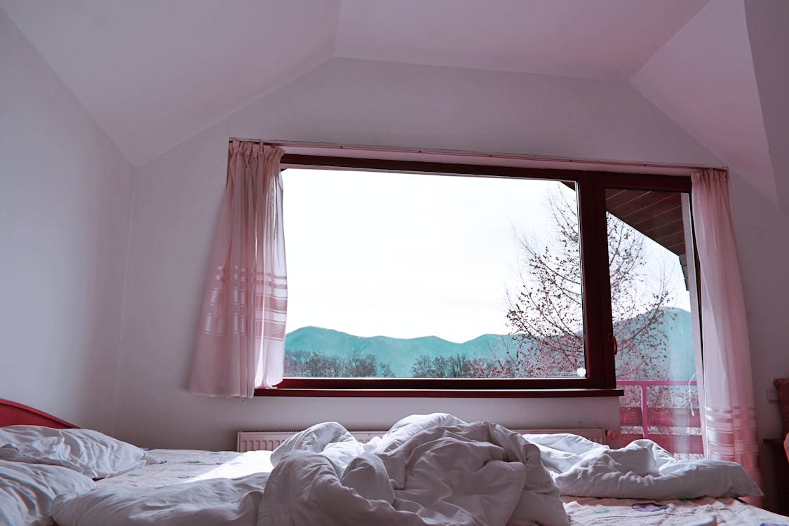
2. Bedroom: Calm & Restful
- Cool blues (powder, sky) – Lower heart rate and promote sleep.
- Muted lavenders – Gentle and soothing for stress relief.
- Warm neutrals (taupe, cream) – Timeless and serene.
Tip: Skip high-energy colors like bright yellow or neon accents.
3. Home Office: Focused & Energized
- Soft greens (eucalyptus, mint) – Boost concentration.
- Warm grays – Professional but not gloomy.
- Peachy neutrals – Uplifting without distraction.
Avoid: All-white rooms (can cause eye strain) or dark browns (may feel heavy).
4. Kitchen: Fresh & Inviting
- Crisp whites + wood tones – Clean and timeless.
- Sunny yellows – Stimulate appetite and happiness.
- Soft blues/greens – Cool and refreshing.
Tip: Red increases appetite (great for dining nooks) but can feel overwhelming on walls.
5. Bathroom: Spa-Like Retreat
- Seafoam green – Evokes water and renewal.
- Pale gray-blue – Crisp and clean.
- All-white with natural textures – Feels open and serene.
Avoid: Dark colors in small bathrooms (can feel claustrophobic).
How to Test Colors Before Committing
- Paint large swatches (at least 2’x2’) on multiple walls.
- Observe at different times of day – Natural light changes color perception.
- Live with samples for 3-4 days – See how the shade affects your mood.
Pro tip: If painting isn’t an option, use rugs, curtains, or furniture in your desired hue first.